Prior to the launch of assetscholar.com, I had done some analysis on Masterworks‘ results and posted it on Medium. There was a lot of interest in those articles, so I wanted to recap them here before potentially providing newer Masterworks coverage.
This article is purely summarizing analysis from older data that was performed in July and August 2022.
Analysis Of Masterworks’ Self-Reported Data – March 2022
How have Masterworks‘ offerings performed so far? We have two types of data to look at. The first is from artworks that were sold in whole to other buyers and the second is from unsold work with updated appraisal data from around the start of spring.
Artwork Sold By Masterworks
I was able to find information on 4 works that were sold by Masterworks:
- Mona Lisa (Masterworks 003) sold October 2019–32% IRR
- Condo (Masterworks 016) sold December 2021–31.7% IRR
- Oehlen (Masterworks 032) sold Feb 2022–33.8% IRR
- Brown (Masterworks 022) sold July 2022–27.3% Annualized Net Return
Please note that the IRR percentages are as reported by Masterworks and unaudited by me. The IRR is calculated net of all costs and fees. At such a high rate of return, investors would have seen the value of their holdings more than double in 3 years (for any of the works above).
Unsold Artwork With Recent Appraisals
There are 51 works that were appraised from February 28 — March 30 of 2022. Here’s what we can learn from the data available.
What Percentage Of Works Have Increased In Value?
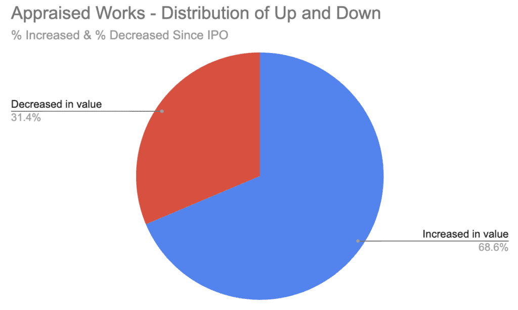
- The majority of offerings have increased in value
What Does The Range Of Performance Look Like For Each Group?
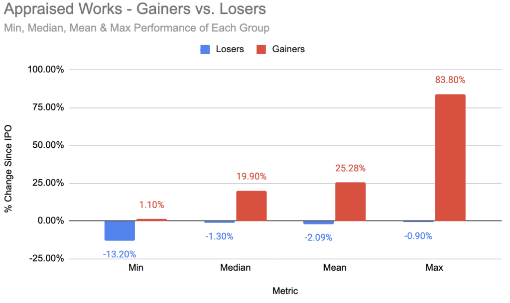
- While the worst performing asset had a sharp correction (-13%), most assets that lost value are down only a small amount (1–2%)
- The gainers have a wide-range of performance, but on average are up a healthy amount (25%)
What Does The Distribution Look Like?
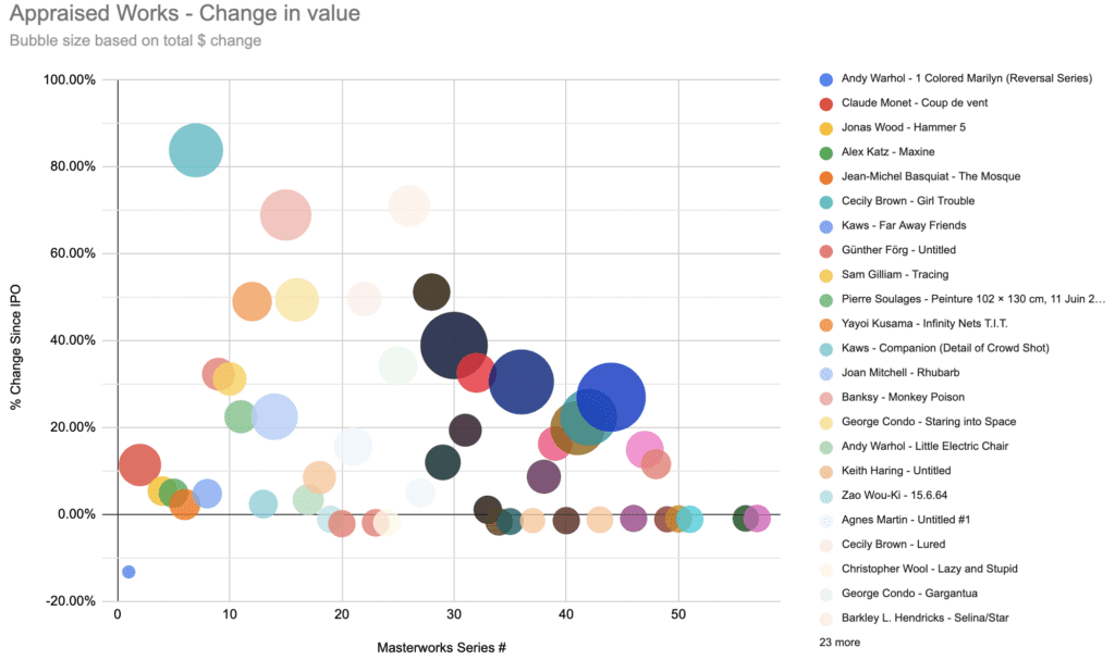
- There is an observable relationship between the series # and the overall performance. This makes sense — a lower series # corresponds to a work that was acquired earlier and has had more time to appreciate.
- In-line with that relationship, the offerings that have decreased in value are biased towards more recent offerings.
- The worst-performing asset is the first asset on the platform — Andy Warhol’s 1 Colored Marilyn (Reversal Series).
- The best-performing asset is series 7, Cecily Brown’s Girl Trouble.
- At least from this visualization, there’s no easily identifiable relationship between the size of the offering (total $ valuation of the artwork) and the returns
How Have Different Artists Performed On Masterworks?
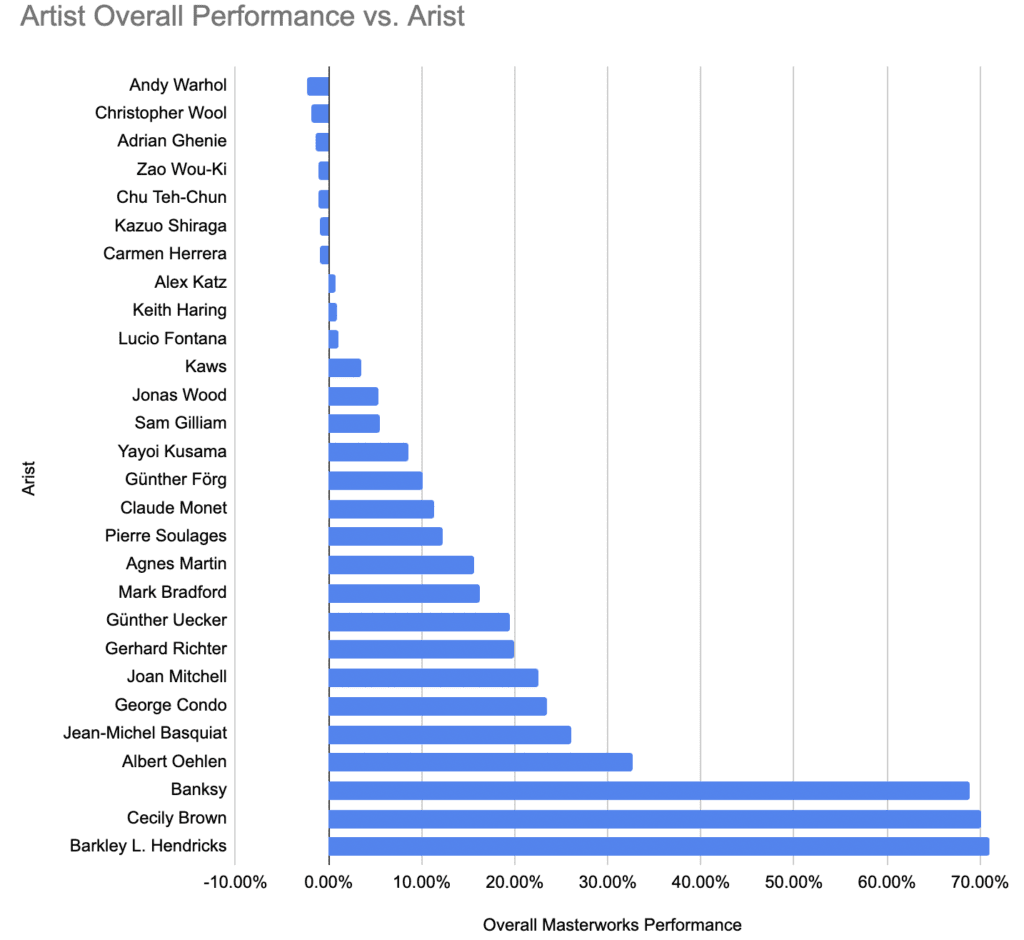
- This is somewhat for fun. There are different numbers of works available on the platform offered at different times, so I’m not sure how much validity anything here will have.
- The calculations were performed by taking the total dollar amount of gains and losses for an artist and dividing by the aggregate offering price of the artist’s works on the platform.
Analysis Of Masterworks’ Self-Reported Data – June 2022
Since I wrote that article, a new wave of appraisal data has come in. So, here’s an updated look at how things stand.
Unsold Artwork With Recent Appraisals
There are now 61 unsold works that have received appraisal updates. The latest round of appraisals took place from June 22 — June 29. Here’s what we can learn from the data available.
What Percentage Of Works Have Increased In Value?
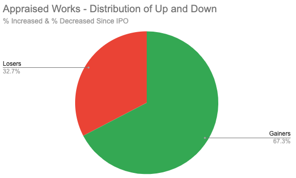
- The majority of works have still appreciated in value since their IPO
- The balance of winners and losers is similar to the prior data set
What Does The Range Of Performance Look Like For Each Group?
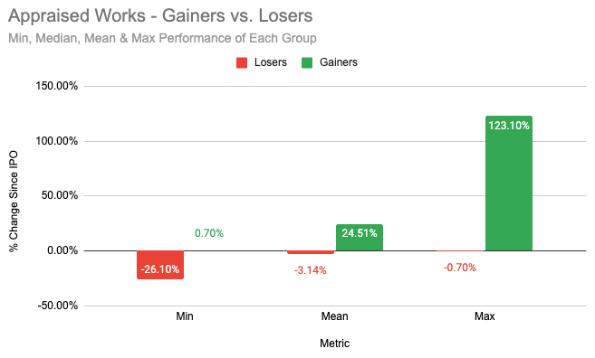
- The worst performing asset saw a very heavy reduction (-26%) in value. The best performing asset has more than doubled (+123%).
- There is more variance between the best and worst performing assets than our last review.
- Despite this, the average performances haven’t changed very much from the March data.
- On the whole, works that lost value are on average only down a little over 3%. Those that gained saw an average gain of almost 25%.
How Have Different Artists Performed On Masterworks?
I have two graphs to share this time, but first, a few important notes on the calculations:
- Different artists will have a different number of works available on the platform, which were offered at different times. Some artist’s data are based on the performance of a single work, while others are based on multiple works.
- The total dollar amount of gains and losses for an artist is calculated first. That figure is then divided by the total offering price of all the artist’s works.
- Any work that was sold by Masterworks is removed. This could produce variability in an artist’s performance when their best-performing work is removed from the dataset.
Current Quarter Performance
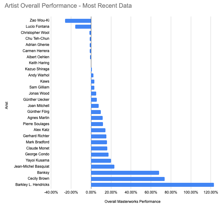
- Two artists have seen heavy declines in their appraised works. All others have seen declines of less than 2%.
- A variety of authors have seen healthy gains, but there are 3 standouts.
Compared To Last Quarter
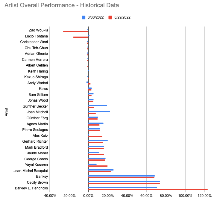
- Zao Wou-Ki, Lucio Fontana, Günther Uecker, and Joan Mitchell were the only artists to see double-digit declines compared to the March appraisal data.
- Zao Wou-Ki and Lucio Fontana are the obvious laggards in the most recent data. For both artists, their performance is based on a single work. For Wou-Ki it’s “15.6.64” and for Fontana it’s “Concetto Spaziale, Attesa.”
- Barkley L. Hendricks, Alex Katz, and Yayoi Kusama were the only artists to see double-digit increases.
- In the June data, Barkley L. Hendricks’ performance is based on 1 work, Alex Katz’s on 2, and Yayoi Kusama’s on 4.
What Are Overall Returns To Investors?
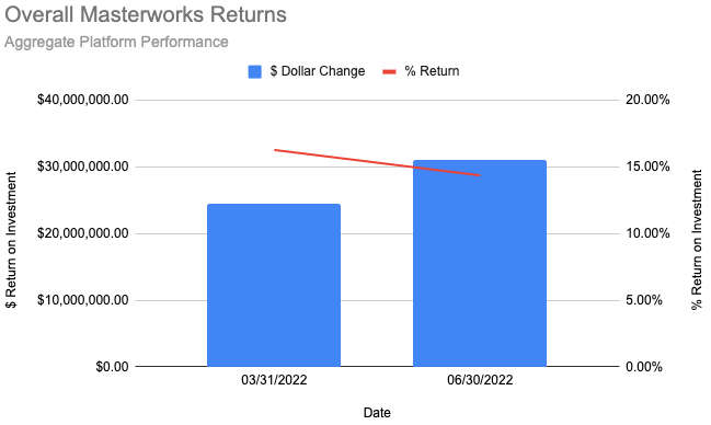
- The Masterworks portfolio has seen just over $31M in total gains since the 61 appraised works’ IPOs.
- That is over a 27% increase from just under $25.5M in total gains from the March data.
- The percentage return on investment declined from about 16.25% in March to a bit over 14.25% in June.
Should We Be Worried About The Decrease In Percentage Return?
In short, the answer is no. In fact, it could continue to see it decline. Here’s why:
Let’s start by revisiting a piece of the first post.
This is looking at performance versus the “series #” each work offered has.
Works that were available on the platform sooner have earlier series #s. More recent offerings have higher series #s. What we see is some relationship between performance and how long it has been since a work’s IPO.
Next, we have to realize that Masterworks’ rate of offerings has increased a lot. When I first joined there were, at most, 1–2 paintings available. Today, I see 5 or more available and I get at least 1 email a week about something new.
More offerings mean that each quarter we will see more works with updated appraisals. At some point, the amount will be increasing significantly quarter-over-quarter.
The newer works have less time to appreciate, so they are likely to have lower rates of appreciation. As those newer assets become a growing part of the calculation, we are likely to see the percentage return continue to decrease.
Analysis Of Trades On The Secondary Market
Did secondary market investors predict changes in artwork valuations?
Unlike many platforms for investing in alternative assets, Masterworks has a secondary market. This allows investors on the platform to sell their shares before a liquidity event.
We recently had updated appraisals for dozens of works in the Masterworks portfolio.
Were traders ahead of the curve? How did the updated valuations affect secondary trading behavior?
For this analysis, I selected 5 different works for us to examine closer. They are:
- 15.6.64 — Worst performer
- Concetto Spaziale, Attesa — 2nd-worst performer
- Grey Ribbon — Top 10 performer
- Pumpkin — Top 5 performer
- Girl Trouble — Almost no change in value
15.6.64
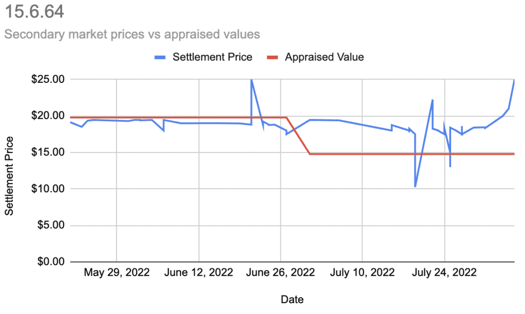
- The secondary market generally seems detached from the appraised values.
- It didn’t “predict” the downturn in price.
- It’s currently front-running what would be a big increase in valuation.
Concetto Spaziale, Attesa
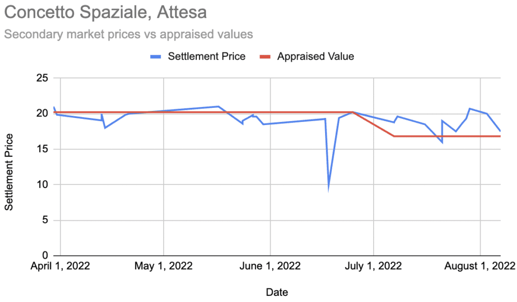
- The secondary market did not predict the price downturn.
- In this case it does seem to have responded to the lower appraised value. Just not to a large degree.
Grey Ribbon
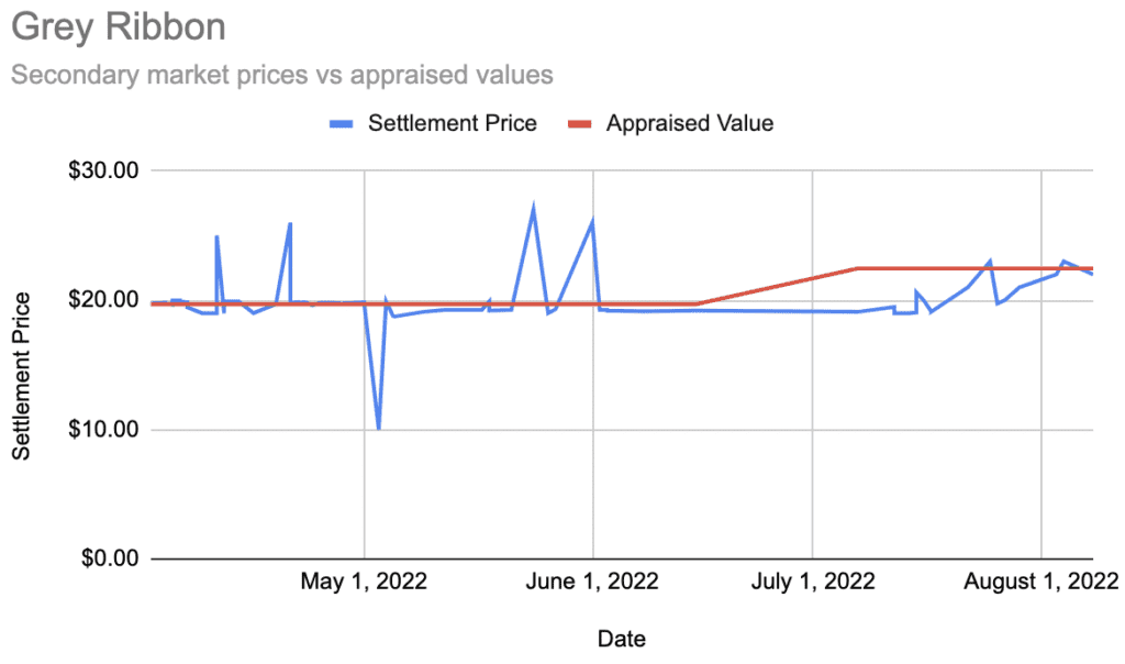
- Again no signs of the secondary market being ahead of the appraised value.
- We see some signs that more recent trades are approaching the newer, increased valuation.
Pumpkin
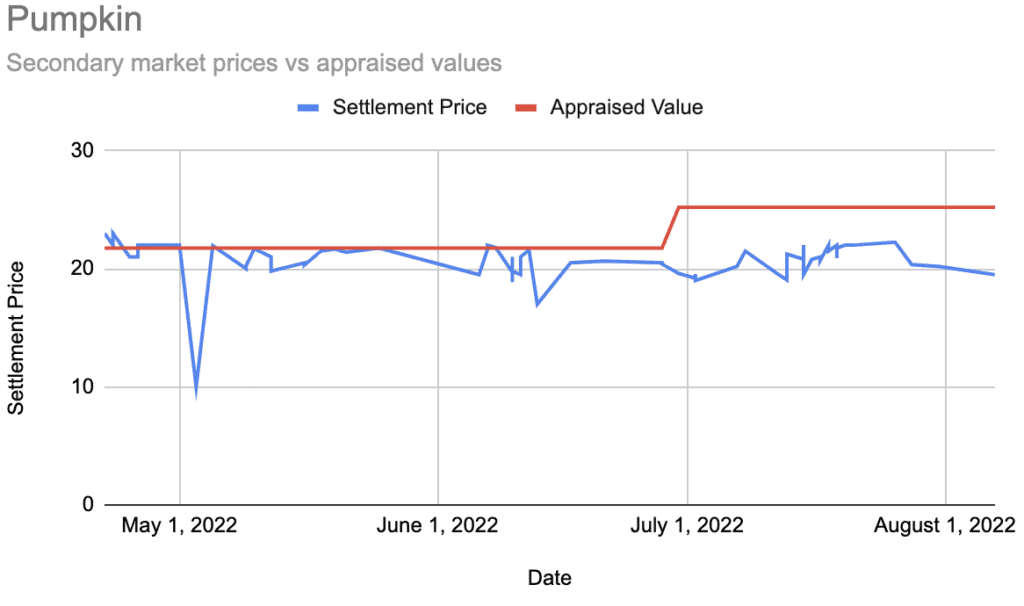
- No signs of the secondary market leading the increased valuation.
- There is no sign that “Pumpkin” investors are responding to the increased valuations.
- Most trades are at or below the March valuation and well below the June one.
Girl Trouble
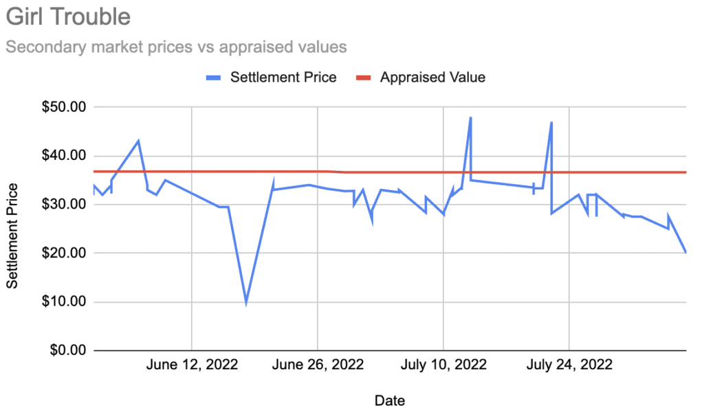
- The vast majority of trades have occurred below the appraised values.
- There is no clear association between the appraised value and trader behavior on the secondary market.
General Observations
From a close-up look of 5 works, the secondary market valuations did not “predict” future valuation increases or decreases.
Are there other interesting trends we can find looking at secondary market trades?
Secondary Trades Below Appraisal Value
When looking at a small sample of works, many secondary market trades occur below the official appraised value. Is that true beyond our 5 hand-selected works?
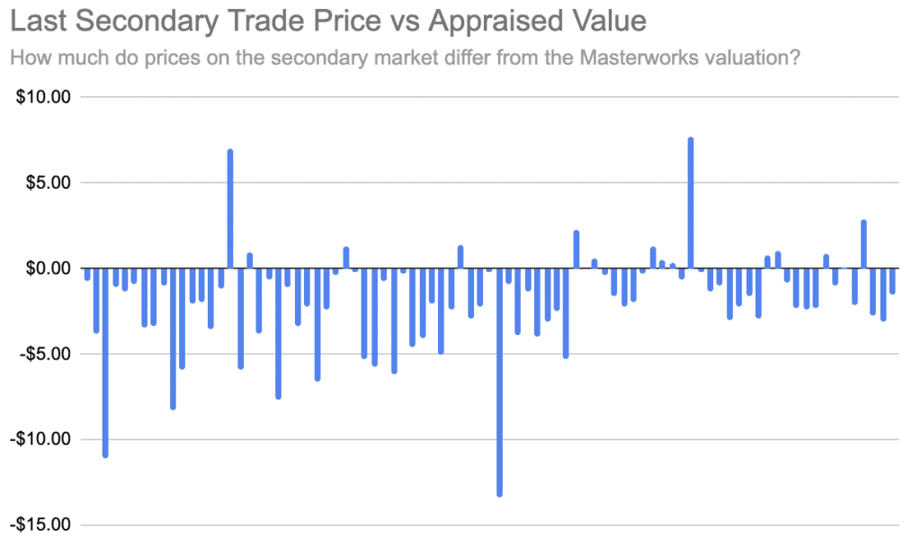
Yep. In fact, almost all the most recent trades occurred at prices below the appraisal value.
Perhaps Too Many People Are Too Impatient
Masterworks’ offerings, as with many other alternative assets, are not inherently liquid. An investment on the platform should be seen as a commitment of capital for 5–10 years.
Looking at our sample of 5 works, an interesting pattern emerges. There seems to be a lot of “gravity” around the $20/share valuation. Not coincidentally that is the IPO and break-even price for an investment.
It seems like many people desire early exits from their positions enough to be happy with getting their initial investment back.
This behavior could also explain why there’s such a large gap between secondary market trades and the Masterworks’ appraisal value across the portfolio.
$10 Bargains
From the 5 works we looked at, every single one had trades occur close to $10. That’s 1/2 the IPO price. This would suggest opportunistic investors may be rewarded by keeping a close eye on the secondary market listings.
Conclusion
“The market” does not seem to be influenced by Masterworks’ valuations, nor does it predict them. Trades often occur around (and sometimes below) a work’s IPO price, regardless of appraised value.
If you missed out on an IPO, there is a good chance you can acquire shares at or near the IPO price. Acquiring shares below the IPO is also very possible. In some respects, it almost seems more beneficial to buy shares off the secondary market than through an IPO.
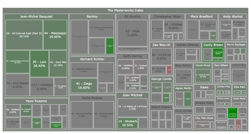
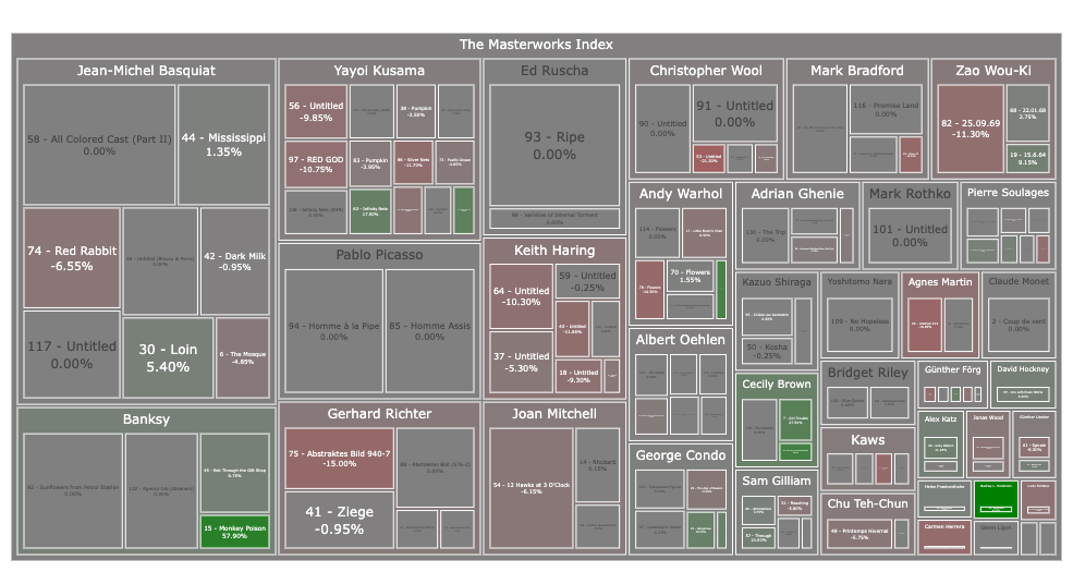
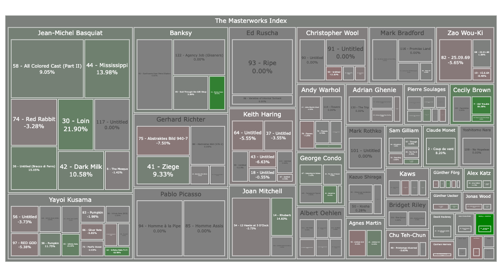
Visualizing Masterworks’ Art Portfolio
What does Masterworks’ collection of art look like when viewed as a capitalization-weighted treemap? The bigger the squares, the larger the portion of the portfolio it is.
Masterworks’ Appraised Values Only
Recent Secondary Market Trades Only
A 50/50 Blend of Appraised Values and Secondary Market Trades
A Few Observations
- Just under half (~46%) of the total value of artwork offered on Masterworks so far is from 5 artists.
- About two thirds of the total value are from the top 10 artists.
- While there have been many works offered on the platform, most are relatively small when viewed in context.
I wonder if Masterworks has intentionally sourced an increasing number of smaller sized works to keep a steady and diversified flow of offerings on the platform as it has grown in popularity.
It will be interesting to revisit this in the future to see if the top artists begin to take up a lesser portion of the art investments on the platform.